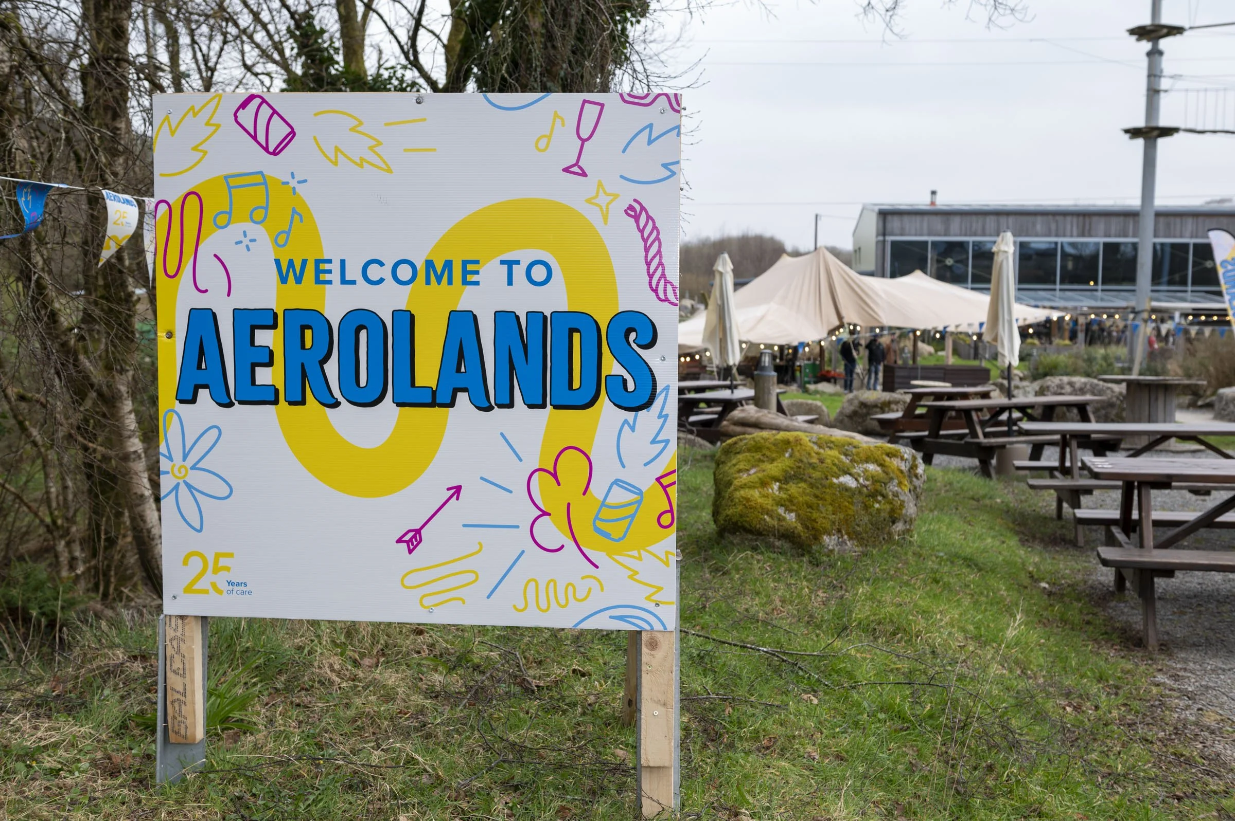
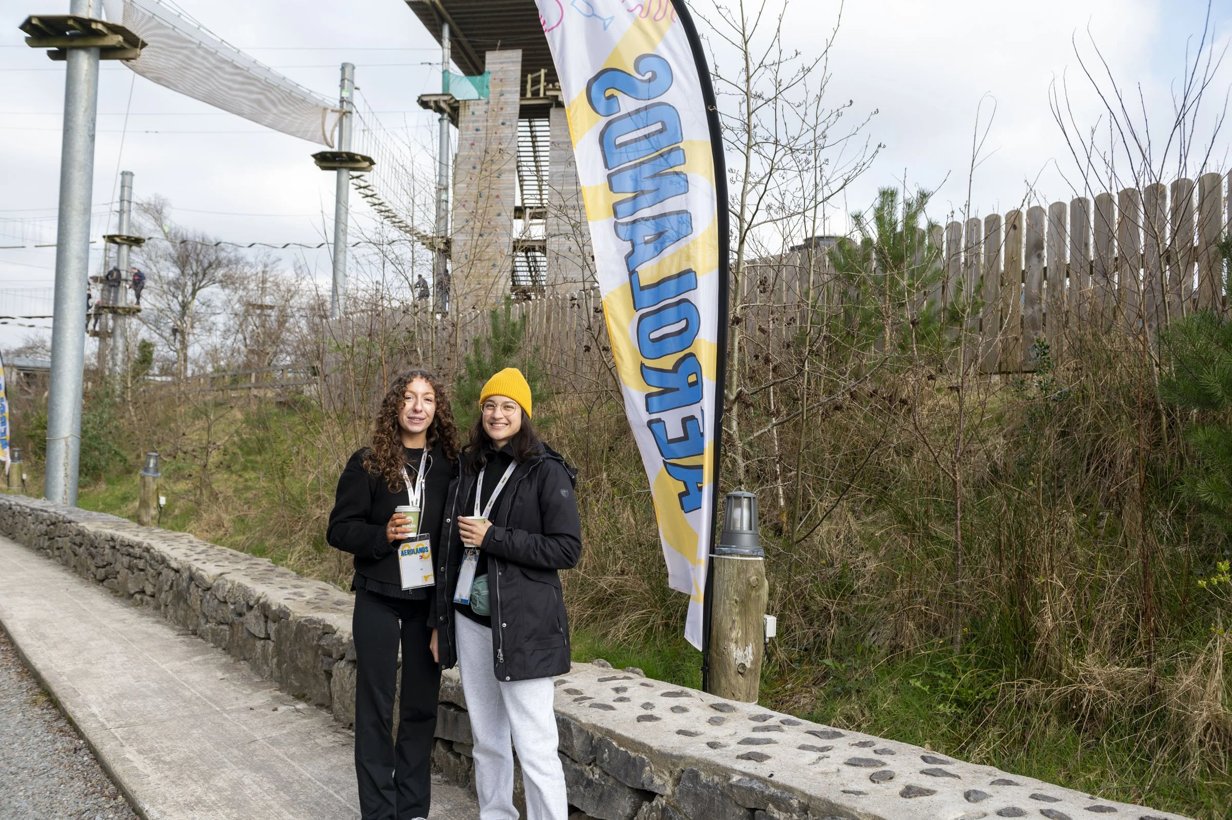
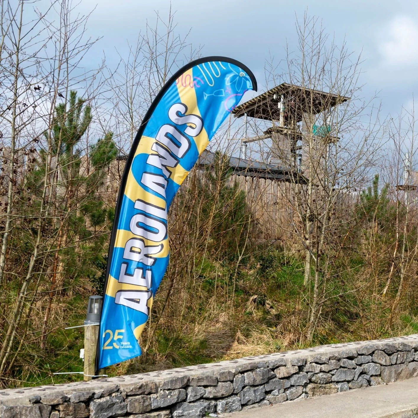
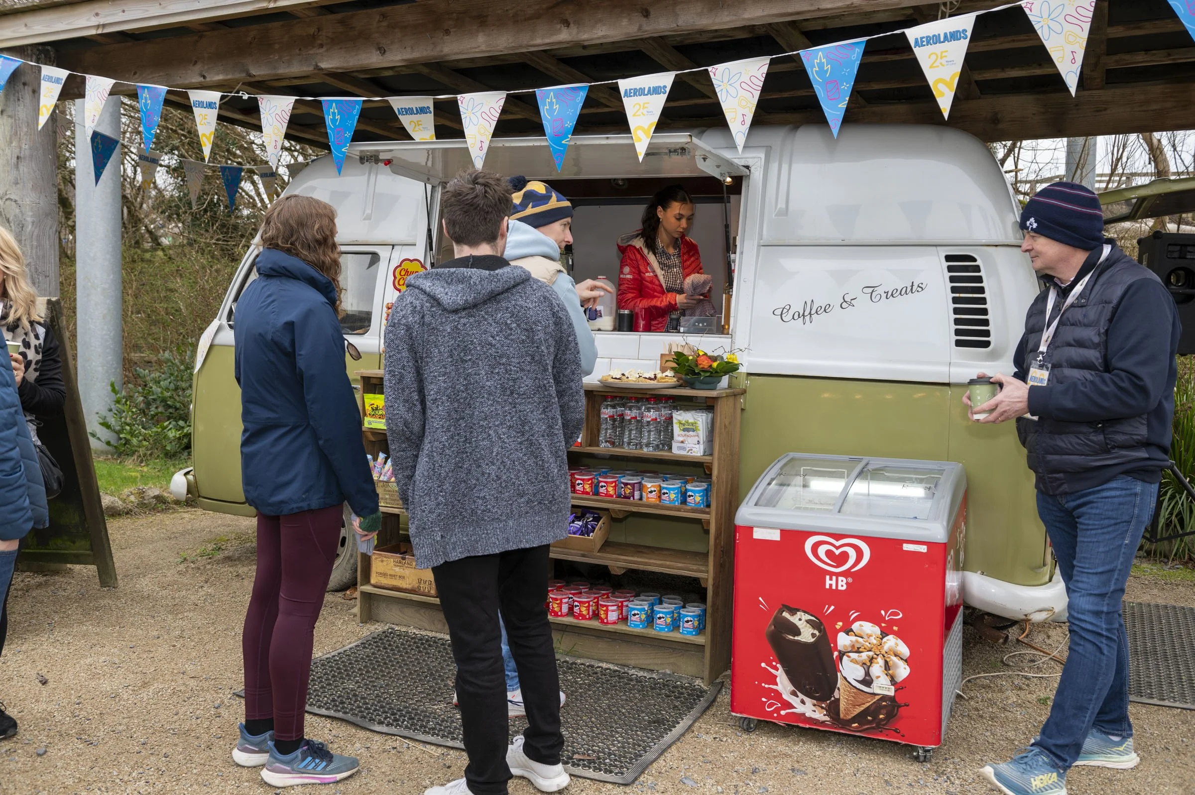
Aerolands
High-energy festival branding for medical company’s celebration.
Irish medical company, Aerogen, wanted to host a festival themed event for all staff in celebration of ‘25 years of care’. The event would take place at a local adventure park and retreat: ‘Wildlands’. The brief was to create something high energy and feeling fresh from the current Aerogen branding, whilst still keeping on-brand.
The solution was a bold, rough-around-the-edges typeface, a reversal in roles of the brand colours, and a collection of doodle-style illustrations. The doodles were sketched by hand and then transferred to a vector style to keep a playful, loose feel to the illustrations.